Restaurant Website Case Study
Yoshi Street Food: A Bold Restaurant Website Built Around Cravings, Orders, and Local Visits
Short answer: This Yoshi Asian Street Food case study shows how a restaurant homepage can feel loud, flavorful, and memorable while still doing the quiet commercial work: make the food desirable, get visitors into the menu, push online orders, and make locations easy to find.
The challenge
Street food brands live or die by appetite. A generic restaurant website with pale photography, tiny menu links, and a quiet booking-style layout would undersell this concept. Yoshi needed the opposite: a homepage that feels fast, punchy, and sensory without becoming chaotic.
The business goals are simple but demanding: show the food clearly, make the brand feel distinctive, move people toward online ordering, and support local discovery for diners who want to visit in person.
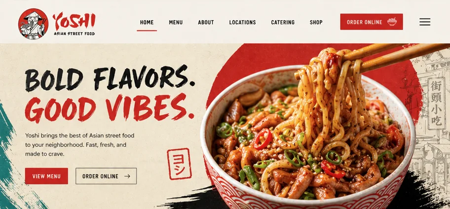
Online orders and menu exploration. The navigation keeps "Order Online" visible while the hero repeats the action with a stronger visual hierarchy.
Location visits, catering interest, and newsletter signups. These appear lower on the page after the appetite-building sections do their job.
Brush lettering, red accents, illustrated mascots, paper texture, lanterns, stamps, and street-market visual cues give the site a recognizable voice.
Fast, fresh, bold Asian street food. Every section supports that promise through copy, imagery, menu cards, or practical ordering information.
Design direction: controlled chaos
The visual system leans into energy: rough brush type, bright red blocks, ink marks, illustrated line art, and large food photography. The important part is that the chaos is contained. The navigation stays clean, the calls to action are obvious, and the menu cards use predictable structure.
That balance matters for restaurants. People should feel the brand before they read every word, but they should never have to hunt for the menu, price, locations, or order button.
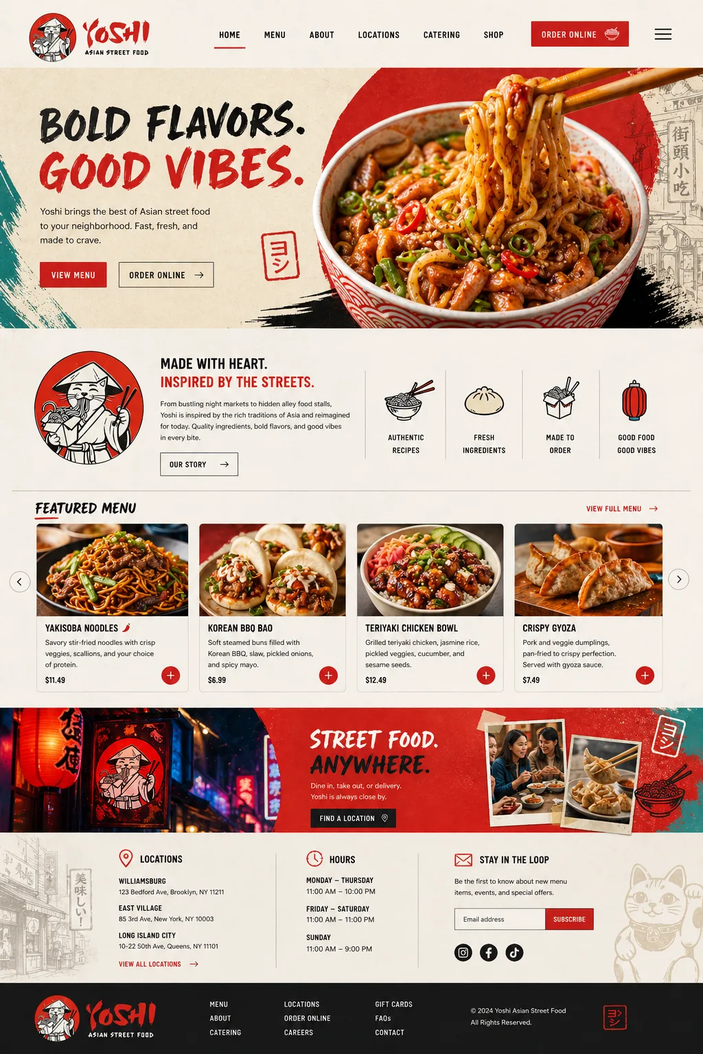
Homepage structure
The page is built like a short sales path for hungry visitors:
- Hero: immediate food desire, brand personality, and order/menu CTAs.
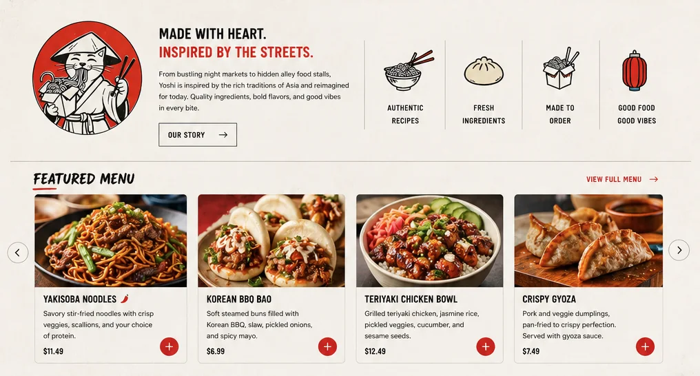
- Story strip: a compact "made with heart" section that gives the brand a reason to exist.
- Feature promises: authentic recipes, fresh ingredients, made to order, good food and good vibes.
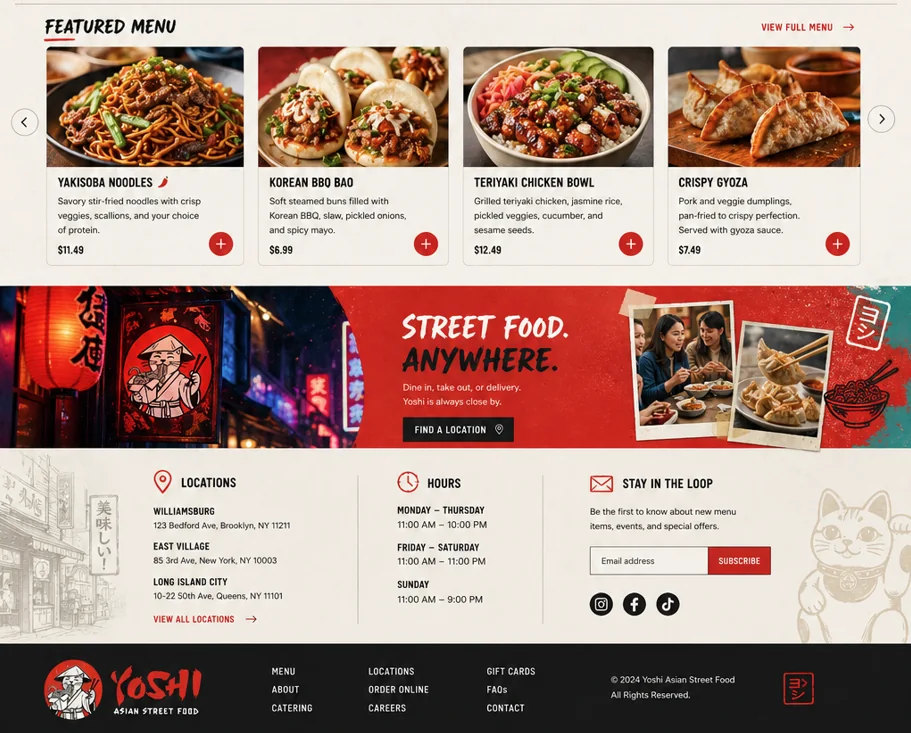
- Featured menu: product cards with photography, description, price, and add action.
- Location banner: reinforces that Yoshi is available for dine-in, takeout, or delivery.
- Footer utility: locations, hours, newsletter, social links, and secondary navigation.
Menu UX: make choosing easy
The featured menu is one of the strongest parts of the concept because it does not over-explain. Each item card gives just enough information to support a decision: a large dish photo, a short appetite-led description, and the price.
For a live restaurant build, I would connect these cards to a full menu or ordering system, then track clicks by category. That data would show which dishes should be highlighted in ads, social posts, and seasonal homepage swaps.
Local SEO and location intent
The lower page handles practical search intent: locations, addresses, hours, and a direct path to view all locations. For a real restaurant launch, this section should pair with location landing pages for each neighborhood, embedded map data, and matching Google Business Profile details.
What I would build next
A polished restaurant homepage is only step one. To turn this concept into a complete growth system, I would add:
- A full menu with categories, dietary tags, and item-level search visibility
- Individual location pages with neighborhood keywords and schema markup
- Catering page with package examples and an inquiry form
- Online ordering integration with tracked CTA events
- Review sections and social proof near order decisions
- Seasonal menu slots for limited-time offers
Takeaways for restaurant websites
The best restaurant websites are not digital brochures. They are appetite engines. They should make people hungry, remove friction, and answer practical questions quickly. Yoshi works because the site leads with food and mood, then backs it up with the conversion paths a real restaurant needs.
Need a restaurant website like this?
If you run a restaurant, cafe, food truck, ghost kitchen, or catering brand, your website should do more than look nice. It should help customers decide what to eat, where to go, and how to order. See my restaurant website service page or start with the pricing section.
Get a custom plan for your business
I'll review your goals and send a clear plan with timeline and price. No obligation.